R has pretty amazing capabilities for creating charts and graphs. One of the most common packages for this is ggplot2. However, it’s not the most intuitive package I have used in R. So, I figured I’d illustrate how to make some relatively simple scatterplots in R using ggplot2. I’ll likely post instructions on how to create other graphs/charts in ggplot2 as well.
As with most of my R examples, I’m going to use the 2010 wave of the General Social Survey (R version here) to illustrate. You can open that file in R and follow along.
The point of a scatterplot is to visually examine the relationship between two variables. Since it’s well-known that there is a relationship between how much education someone has and how much money they make, let’s examine that relationship visually. The two variables in the GSS we’ll use are: EDUC (years of education ranging from 0 to 20, with 12 being a high school diploma and 16 a Bachelor’s degree) and REALRINC (the respondent’s income in 1986 dollars). Just because I want the resulting scatterplots to be more accurate, let’s go ahead and adjust the REALRINC into 2010 dollars first. Per this website, we need to multiply each income listed in the 2010 GSS by 1.989 to get 2010 dollars from 1986 dollars:
GSS2010$REALRINC2010 <- GSS2010$REALRINC * 1.989
Let’s just make sure the values make sense. To do that, first pull the first 10 incomes:
head(GSS2010$REALRINC, 10)
The “head” command tells R to simply list the first “10” values in the variable “REALRINC” and print them in the console. Here’s what I got as output:
[1] 42735.0 3885.0 NA NA NA 5827.5 42735.0 NA NA NA
We can check to see what the corresponding value in 2010 dollars is for the first value, $42,735, with the following command:
GSS2010$REALRINC2010[match(42735,GSS2010$REALRINC)];
The value I got was $84,999.92, which is $42,735 * 1.989. Groovy. Our formula worked.
Now to create the scatterplot. Install ggplot2 (I’m using version 3.2.1) and load the library.
install.packages("ggplot2")
library(ggplot2)
Now begins the rather bizarre part of working with ggplot2 – building the commands to create the charts.
The basic code for creating plots in ggplot2 is odd. You create a base object that includes the variables that will be used for creating the chart like this:
scatterEDUCxINCOME <- ggplot(GSS2010, aes(EDUC, REALRINC2010))
The first portion, “scatterEDUCxINCOME” is the base object.
“ggplot” calls the ggplot2 package.
In the parentheses is, first, the database (GSS2010), followed by the “aesthetic” components of the chart (“aes” stands for aesthetic). In this case, it’s the two variables we’re going to use: EDUC and REALRINC2010.
This base object is really just the data for the scatterplot but not the scatterplot itself. To illustrate, you can tell R to display the base object:
scatterEDUCxINCOME
You’ll get some of the pieces of a scatterplot, but not the points:

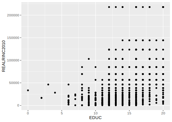
To overlay the scatterplot onto the base object, you have to tell R what objects you want to be overlaid. Obviously, that should include the points, which would be done like this:
scatterEDUCxINCOME + geom_point()
“geom_point()” tells R to overlay the geometric points for the scatterplot onto the base layer. The parentheses are useful as they allow for additional commands or modifiers for the points, as I’ll illustrate below.
Two points to note with the code above. First, when you run it, it will generate the scatterplot (see image below).
Second, you can actually save this entire piece of code into the base object, like this:
scatterEDUCxINCOME <- scatterEDUCxINCOME + geom_point()
However, doing so converts your base object into the scatterplot with the geometric points included. Since you may want to modify your scatterplot with additional features, it’s generally a good idea to not do that. Keep your base object simple and overlay things on top of it as you go until you get to where you want to be.
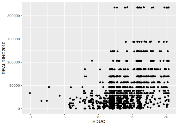
As noted, the geom_point() code can be modified. One of my favorite modifications is to add a command that adds a little bit of entropy to the scatterpoints, which is helpful when you have a large dataset. Otherwise, all the points are basically stacked on top of each other. Here’s how:
scatterEDUCxINCOME + geom_point(position = "jitter")
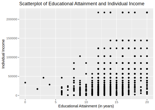
Of course, a scatterplot should have labels – a title and axis labels. ggplot2 tries to add the axis labels based on the names of the variables, but you can overlay these as objects onto the base object as well, like this:
scatterEDUCxINCOME + geom_point() +
   ggtitle("Scatterplot of Educational Attainment and Individual Income") +
   labs(x = "Educational Attainment (in years)", y = "Individual Income")
ggtitle adds a title to the chart.
labs(x = “”, y = “”) adds the labels for the x and y axes with the labels inside the quotes.
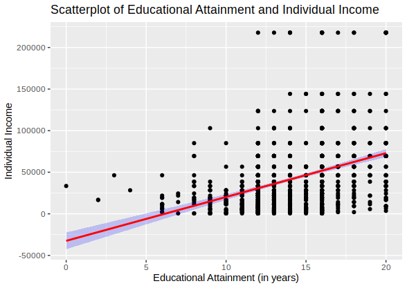
Two additional features are helpful in a basic scatterplot. First, adding a line to the chart to illustrate the relationship is helpful. I’ll show two. First, a standard regression line is always nice:
scatterEDUCxINCOME + geom_point() + geom_smooth(method = "lm", color = "red", alpha = 0.2, fill = "blue") +
   ggtitle("Scatterplot of Educational Attainment and Individual Income") +
   labs(x = "Educational Attainment (in years)", y = "Individual Income")
The code to add a smoothing line is geom_smooth. In this case, I modified that line to make it linear (“lm”), make it red (color = “red”), and changed the fill of the error around the line (fill = “blue”). The last modification was to change the transparency of the fill for the error (alpha = 0.2).
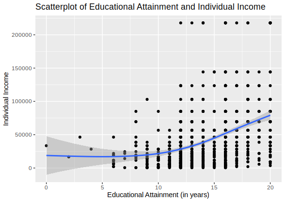
Other smoothing options are available. The default simply runs a best fitting line through the scatterplot:
scatterEDUCxINCOME + geom_point() + geom_smooth() +
   ggtitle("Scatterplot of Educational Attainment and Individual Income") +
   labs(x = "Educational Attainment (in years)", y = "Individual Income")
Finally, the scatterpoints can be modified in a variety of ways (e.g., thickness, transparency, color, etc.). Here’s a simple illustration:
scatterEDUCxINCOME + geom_point(position = "jitter", size = 4, colour = "green")
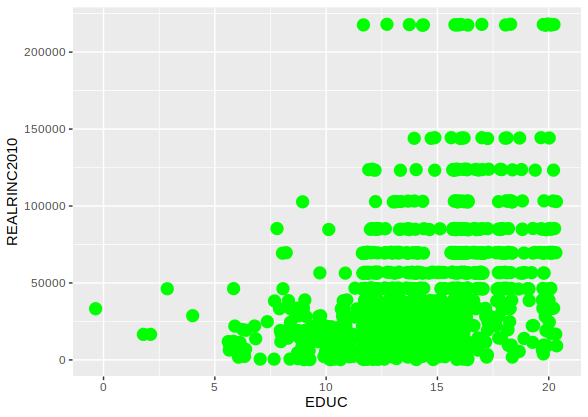
The points options that can be modified are detailed here.
A script file with the above commands is available here.
NOTE: This was done in R version 3.5.2.
![]()
