

For my job, I occasionally need to create maps to illustrate some concept or another. For instance, it can be useful to see a the racial makeup of the US as a map color-coded to reflect the percent of the population that identifies as black in each state. It provides a quick illustration of how people identifying as a certain race are distributed across the US. Back when I used Windows, I had a hard time finding simple software that would create maps like this, but it seemed like there were more or at least cheaper options with Windows. However, you can’t beat free, and that’s how much the software you’ll need for this tutorial costs! I’m going to do this tutorial in three parts: 1) Getting ready; (2) Creating your map; (3) Preparing your map for printing/export.
Part 1: Getting Ready to Create a Map
- To begin with, you’ll need some software. The software I’ll be using is called QGIS. It’s free and is included in most Linux repositories (it’s included in the Ubuntu repositories; I run Kubuntu). That makes it easy to install, either from Synaptic or from the terminal (e.g., sudo apt-get install qgis python-qgis). QGIS runs on Windows and Mac as well, so this tutorial will probably work for those OSes, too. So, step 1 is to install QGIS.
- You’re also going to need some shape or map files. You can create your own, but you don’t want to do that as it takes forever and almost any common map you could want has already been created for you. There are two great places to download maps: For maps related to the US, try the U.S. Census Bureau’s Tiger files website. The shape file I’ll be using for this tutorial came from their website. For a broader array of maps, try NaturalEarthData, which has lots and lots of maps to choose from. Download the shapefile’s you think you’ll want, unzip them, and store them in a location where you can access them readily.
- Finally, if you’re adding data to your map, you’ll need that data, ideally in a spreadsheet. There are lots of sources of data. I tend to use a lot from Statistical Abstracts, which is now run by Proquest since it was defunded by the Census Bureau. But you can use data from wherever. The key, however, is to make sure it’s cleanly entered into a spreadsheet.
Part 2: Creating Your Map
- Once you have your software installed, you’ve download the necessary shape files, and you’ve got your data ready, it’s time to create your map. First, open QGIS. You’ll see a blank screen with lots of buttons and such. Lots to do here, but we’re going to keep this simple.
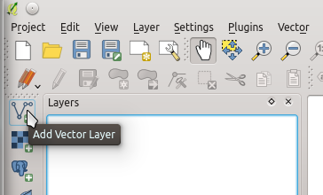
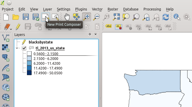
- The first thing you need to do is add your shapefile. Assuming you have downloaded the shapefile and unzipped it, let’s import it into QGIS. You’re going to add it as a layer. Click on the add vector layer button:
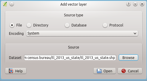
- You’ll then need to find the map file you want to import using the “browse” button and click “open.”
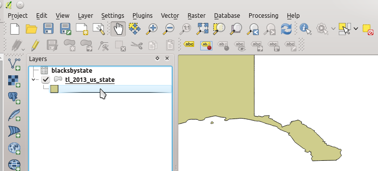
- You should then see the map show up in QGIS.
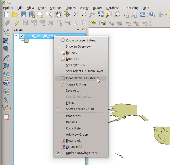
- You’ll next need to make sure that you’ve properly prepared your data for importing into QGIS. There are two things you need to check. First, right-click on the map or shapefile you just imported and scroll down to “Open Attribute Table.”
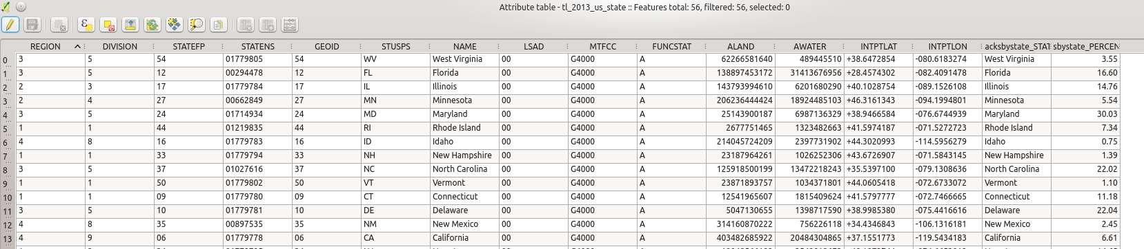
- You’ll now seen a table with lots of information. This table basically provides all the information to QGIS to tell it how to generate the map. You’re going to link your data to this table.
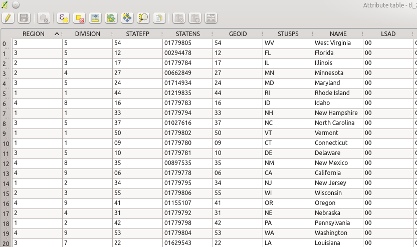
- What you need to find is a variable in the table (one of the columns) with information that you can use to link your data file with this table. You should probably use something like “GEOID” or “NAME”.
- By clicking on the header of any of the columns, the table will be sorted by that column. Since I’m using states for my map, I clicked on the column header “NAME” so the states are sorted alphabetically. I then checked the names of the states and the GEOID with those in my data file in a separate spreadsheet. (Here’s a file with accurate names and GEOIDs.) You’re checking these because this is how you’ll link your data to this table. Make sure that you have the correct names or GEOIDs in your data file. Whichever variable/column you choose to link the shapefile and your data file, it’s a good idea to use the same column header in your data file as exists in the shapefile attributes table. As you can see, I’m using GEOIDs. (Hint: Most GEOIDs in attribute files have zeros in front of small numbers, like “001” instead of “1”. To link files, you should set your GEOID column in your spreadsheet software to “text” rather than “numbers” or those zeros will disapper and QGIS won’t link those records.) Here’s how my data file looks in LibreOffice:
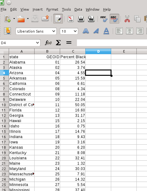
- Now, if you’re using LibreOffice, save your data file as a “.dbf” file. That’s the file format that QGIS reads.
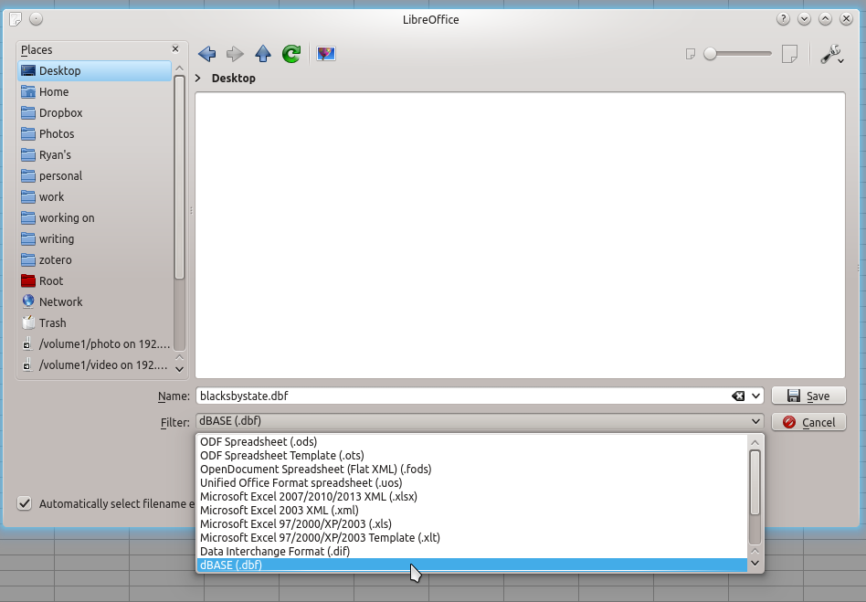
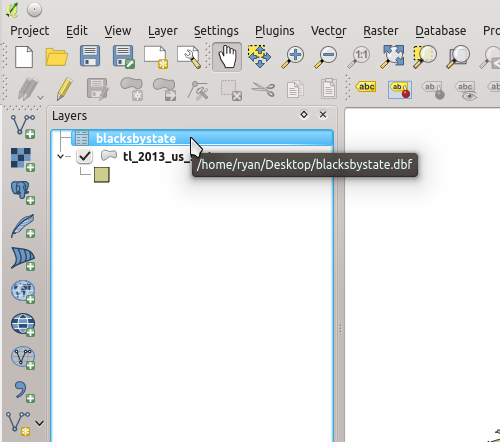
- Now you’re going to import your data file into QGIS. Go back to QGIS and click on the same button you used to add a vector layer. You’ll have to tell QGIS that you want to see “All Files” as it won’t show DBF files by default, but it can import them.
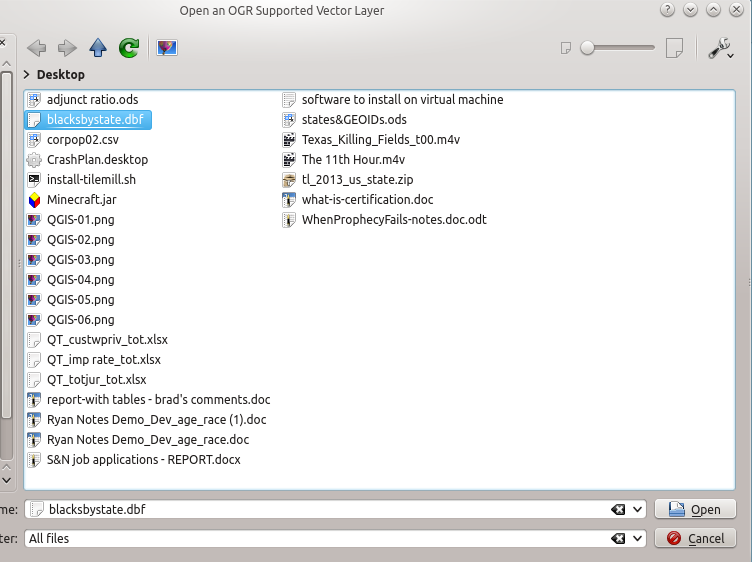
- Find your DBF file and select “Open.” You’ll now see it in the list of layers.
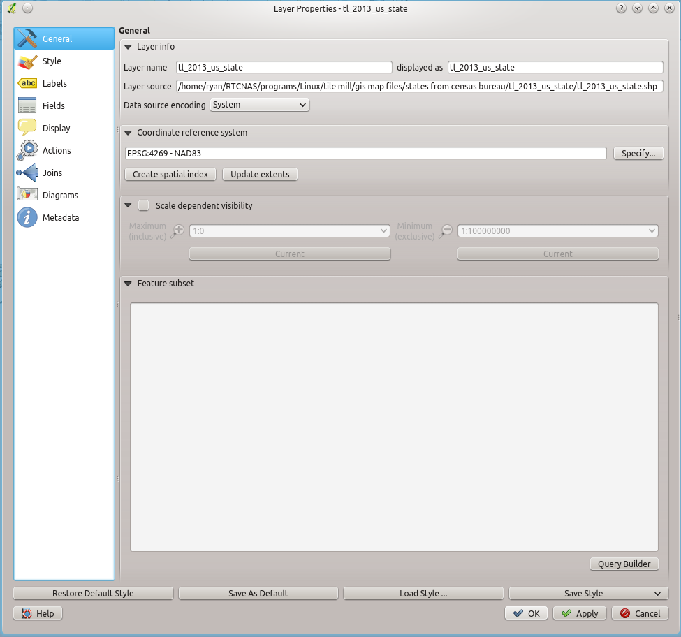
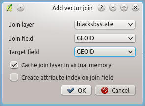
- Now for the important part. You’re going to link or join your data file with the the shapefile attribute table. To do this, double-click on the shapefile in the layers box in QGIS and you’ll get a new window:
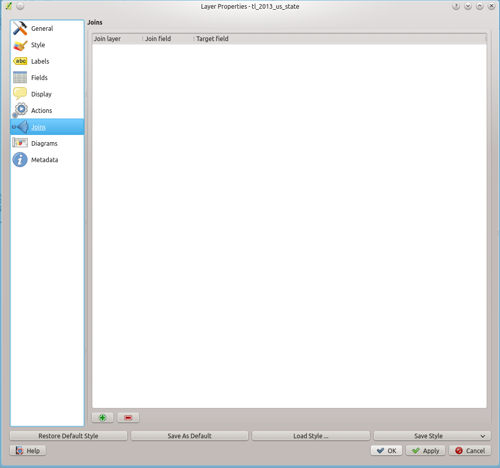
- Click on the “Joins” tab and you’ll see this:
- Now click on the green + icon and you’ll see this window:
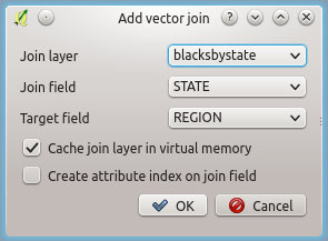
- In the “Join layer” field, choose your data file you imported. In the “Join field” field, choose the column header for the variable you are using in your data file to link to the attribute file. In my case, it is GEOID. In the “Target field,” choose the column header your linking your data file to in the attribute table. In my case, it is GEOID. Like this:
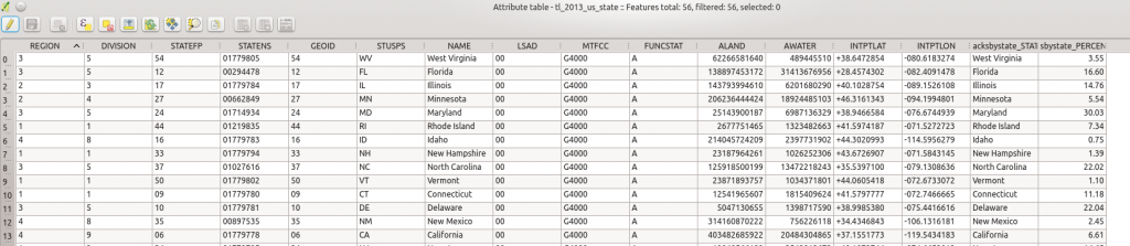
- Now hit OK on that window and then “OK” again on the properties window and your data file should be linked to the Attribute Table of the shapefile. You can check that the join worked by right-clicking on your shapefile and opening up Attribute Table again. You should see your data added to the end of the Attribute Table file. (NOTE: QGIS is smart enough to know when there isn’t data for a row in the joined data and inserts NULL instead. For instance, I didn’t import any data for Puerto Rico, so that is listed as NULL. Also, if for some reason your data don’t get linked, it will insert NULL. That’s usually a sign that you didn’t enter a value in correctly on your linking variable.)
- If your data are in the Attribute Table, you’ve succeeded with the hardest part of this project. Now we just need to display that data on the map. QGIS makes displaying data based on colors very easy. Just below the shapefile you should see a box (it’s called a “group”). That box is basically just a stand in for the current map that is being displayed.
- Double-click on that box and you’ll get a new “Layer Properties” window. In that window, click on “Style.”
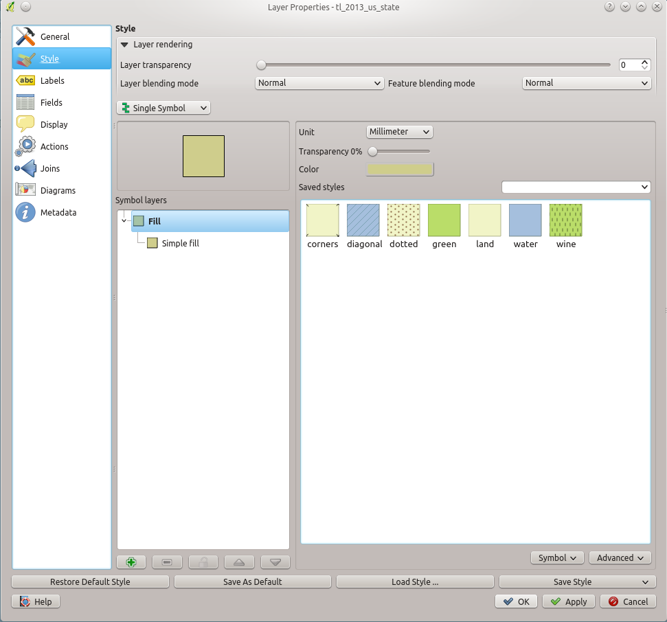
- If you want QGIS to do most of the work of coloring for you, look for the dropdown menu that says “Single Symbol.” That is the current color of the map. Click on that and choose, instead, “Graduated.” The options in the window will now change. “Graduated” means that the color coding will be based on the values of the variable you choose. You can choose how many colors to display where it says “Classes.” You can change the colors used where it says “Color ramp”. You can choose the width of the intervals where it says “Mode.” But, most importantly, we want to choose the variable that is going to be used for calculating the colors where it says “Column.” Like I have below:
(insert screen capture here)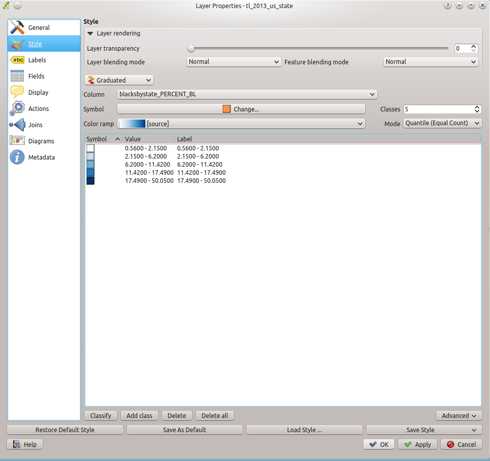
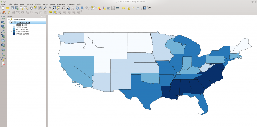
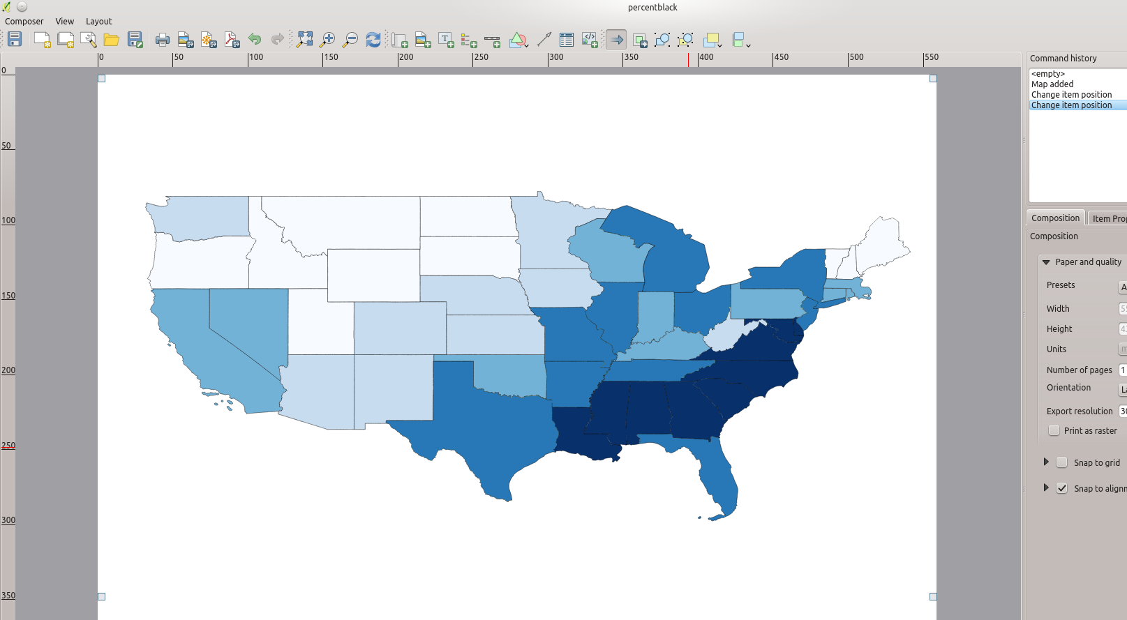
- Once you’re ready, click “OK” and watch your map change to reflect color coded values based on your variable, like this:
- At this point, you’ve successfully created your map. In Part 3 below I’ll show you how to prepare your map for exporting to an image file or for printing.

Part 3: Preparing Your Map for Printing/Exporting
- It may seem like you’re done at this point, and you’re pretty close, as you’ve done the hard part. But QGIS has an additional feature that makes creating maps even nicer – composing the finished map. Yes, you could just take a screen capture of the map you created and that may be sufficient, but wouldn’t it be nice to have a legend? And a title? And, in my case, include Hawaii and Alaska all in the same image? You can do all of that from the “Print Composer” feature of QGIS. To open the Print Composer, click here:
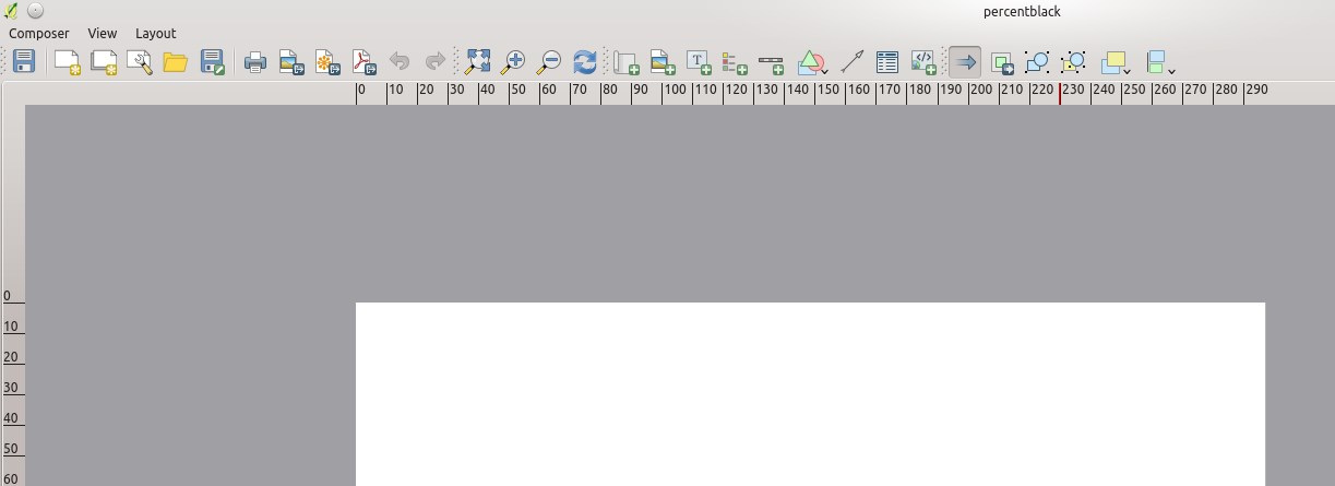
- Once you click on the “Print Composer” button you’ll be asked to give your print a title. Title it whatever you want, then you’ll see this screen:
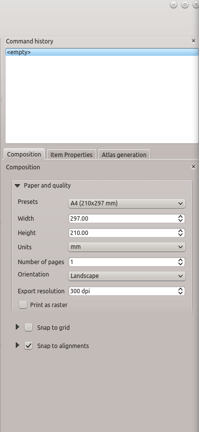
- The first thing you’ll want to do is set your Composition size. If you’re going to save your map as an SVG file, size won’t really matter. But if you’re saving it as any other image file, you should probably go as big as possible. This is done using the “Composition” tab on the right side of the screen.
- Next, you’re going to want to import the map you just created as the center piece of your print. To do this, click on the “Add new Map” button:
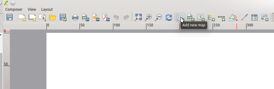
- When you click on that button, you’ll then be able to draw a rectangle on your canvas (the white area) that will import onto the canvas whatever is showing in the main QGIS window. So, make sure that whatever you want to import onto your canvas is showing in the other window, then drag your rectangle to import it.
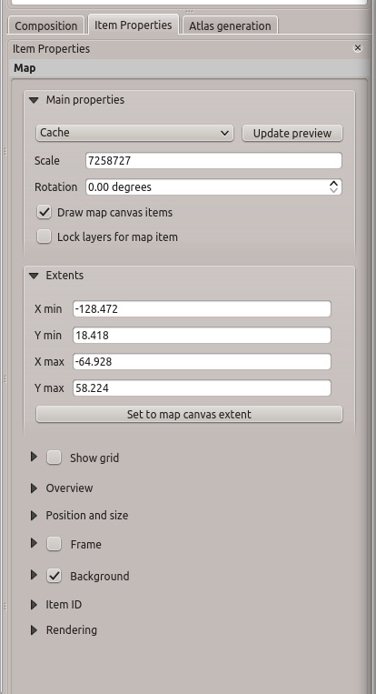
- You’ll then want to switch to the primary selection tool, which is what you’ll use to interact with the different components of your map composition:
(insert)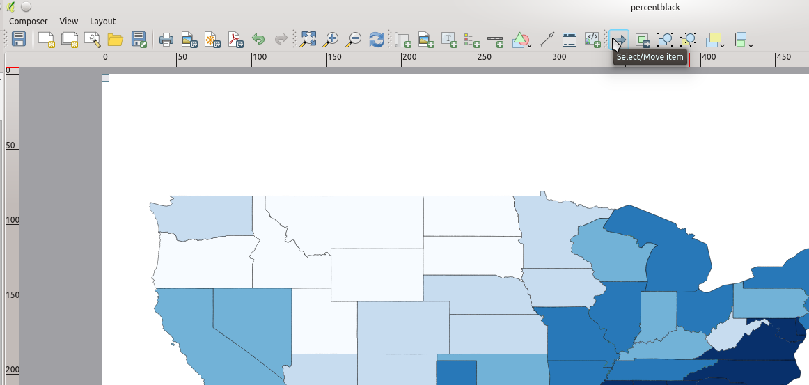
- By selecting one of the components of your map, you can also modify it’s properties on the right hand side under “Item Properties”:
- We now have the main part of our map. But, in my case, I also want to include Alaska and Hawaii, as well as a legend. To add Alaska and Hawaii, recenter the primary QGIS window over them one at a time and then import them the same way you imported the continental US.
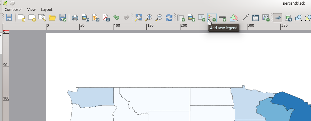
- The next item I want to add is a legend. To add a legend, click the icon at the top of the screen to do so:
- You can adjust the properties of the legend under the “Item Properties” tab on the right of the canvas.
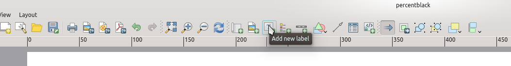
- The final item you should add is a title. This is done with the “Add new Label” button at the top of the screen:
- Like the other items, you can adjust your title under the “Item Properties” tab until you’re happy with it.
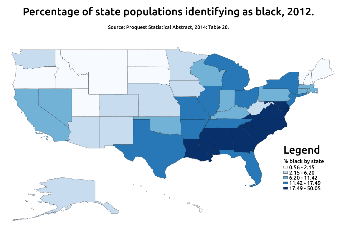
- Once you’ve got your map how you want it, it’s time to export it. If you aren’t familiar with SVG files, they are really neat. Basically, they can scale to any size without pixelating because of how they are stored (SVG stands for “scalable vector graphics”). That’s probably the ideal format for exporting. But you can also export the map in a variety of other formats. Below is the final map exported as a PNG file.
Notes:
I drew on the following tutorials to create this one.
- http://www.qgistutorials.com/en/docs/making_a_map.html
![]()
