While a bit technical, it’s occasionally useful to plot multiple data series that have very different scales in the same chart. Let me give an example to illustrate. Let’s say I want to see whether the number of Mormon temples being built aligns with the number of Mormon stakes (akin to a Catholic diocese) that are organized over time. (I’m a sociologist who studies religion; you’ll just have to go with my examples.)
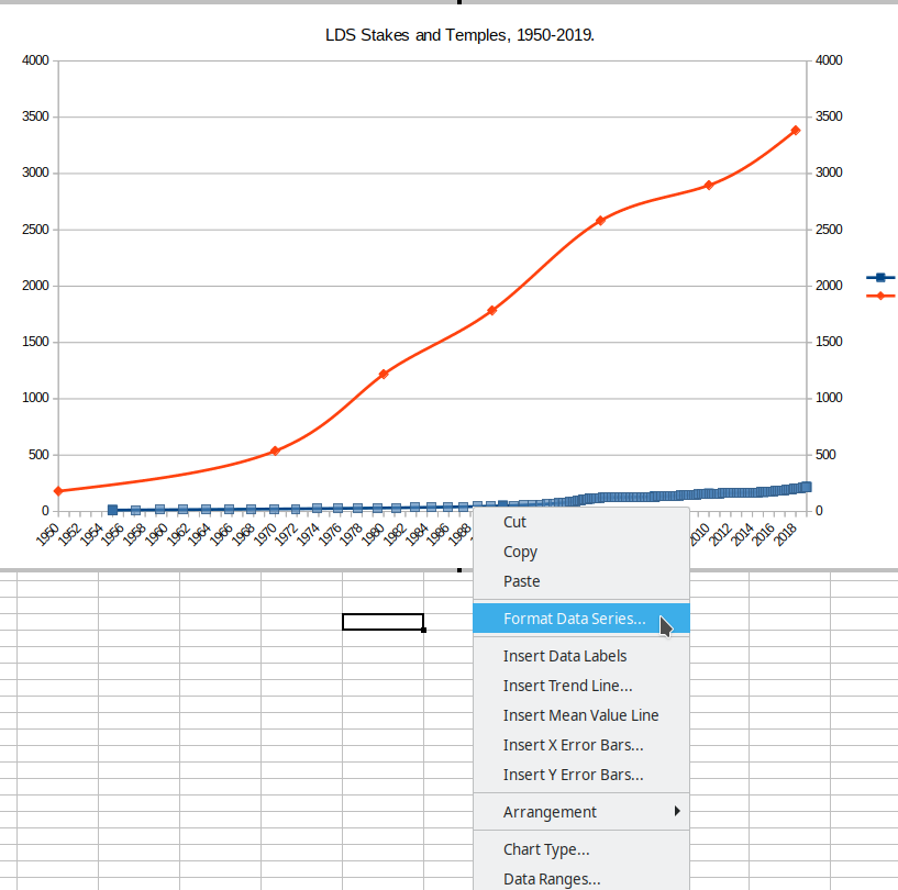
However, the number of Mormon temples is in the hundreds while the number of Mormon stakes is in the thousands. If I plot them both on the same chart with the same y-axis (that’s the vertical axis), the number of Mormon temples is going to look really small and I won’t be able to see the variation over time in the number of temples, like this:

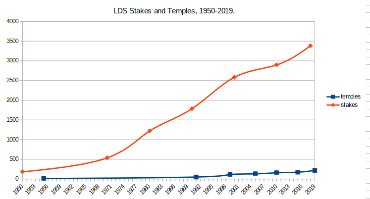
The chart shows that stakes have increased, but it looks like the number of temples has barely moved. LibreOffice Calc automatically creates the scale used for the y-axis based on the scale of the larger of the two data series, in this case, the number of stakes. Thus, the maximum value is 4,000 and the minimum is 0. What I want to do in this tutorial is to illustrate how to add a second y-axis on the right side of the chart that uses a different scale that is more appropriate for the number of temples.
To begin with, go ahead and create your chart with at least two data series, as I have shown in other tutorials, like this one. Once you have your chart with two data series complete, now it’s time to add a second y-axis with a different scale.
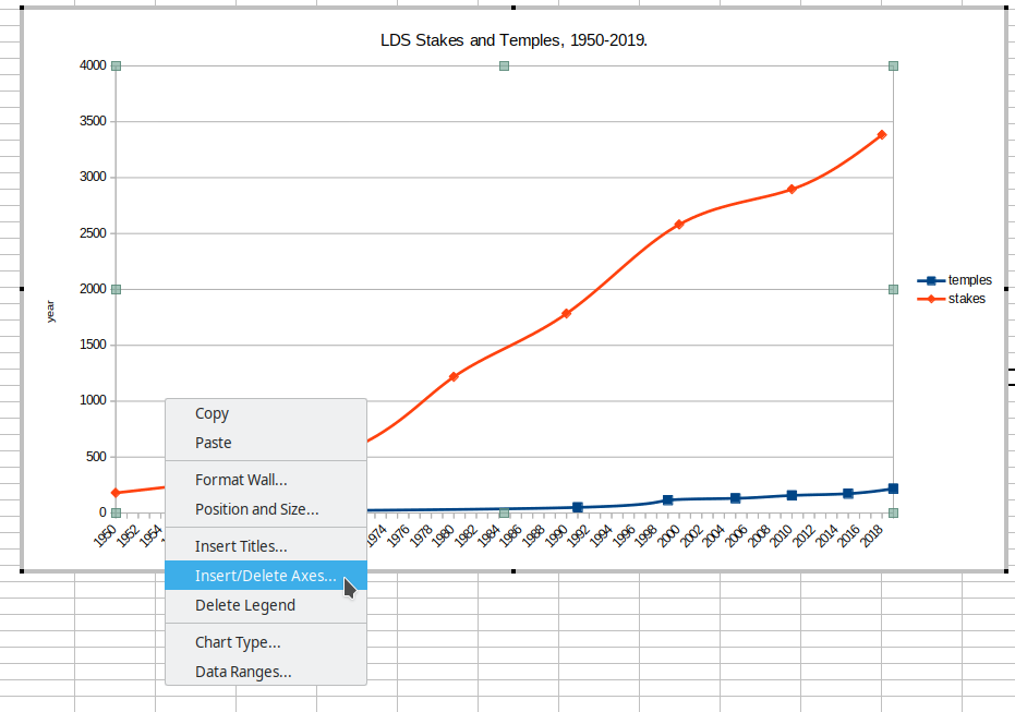
First, click on your chart then double-click it to open chart editing. Then, select the chart area by clicking on one of the axes (left or right doesn’t matter) and then right-click it. You’ll get a context menu with the option “Insert/Delete axes…” Select that:

In the window that pops up, you’ll see a second column labeled “Secondary Axes.” You want to select “Y axis.”

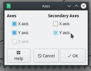
Click “OK” and you’ll see that a second y-axis has been added to your chart on the right side using the same metric as the left side:

The next steps are pretty straightforward, but before you do them, you should pause and think for a second so you don’t have to go back and undo what you’re about to do. You’re going to change the scale of one of the two y-axes, but which axis do you want to change? There isn’t a right or wrong answer here. Generally speaking, I typically see charts like this with the smaller of the two ranges assigned to the left axis and the larger assigned to the right axis, but, again, it is entirely up to you which way you choose to go. At this point, though, you need to make a decision. Then you can move to the next step.
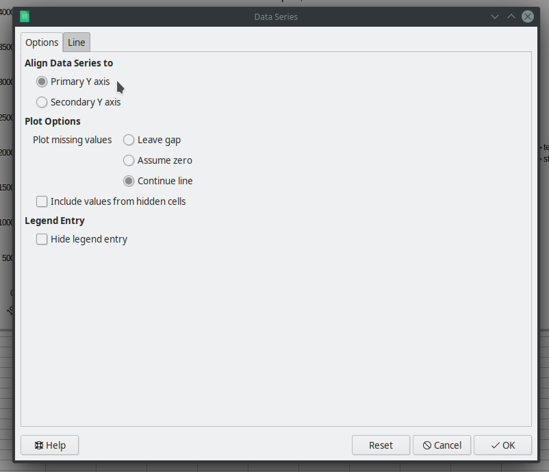
I’m going to follow my suggestion above and change the y-axis on the left to a scale that fits with the number of temples (so, a smaller range of values) and keep the y-axis on the right with the larger range for the number of stakes. But before I change the scales of the axes, I need to tell LibreOffice which data series is going to align with which axis. Here’s how. Click on one of your data series lines, then right-click it and select “Format Data Series.”

In the window that pops up, you’ll see on the “Options” tab right at the top an option that says, “Align Data Series to” and then “Primary Y axis” (this is the one on the left of the chart) or “Secondary Y axis” (this is the one on the right of the chart). Since I selected the number of temples first, I’m going to leave that one aligned to the Primary Y axis:

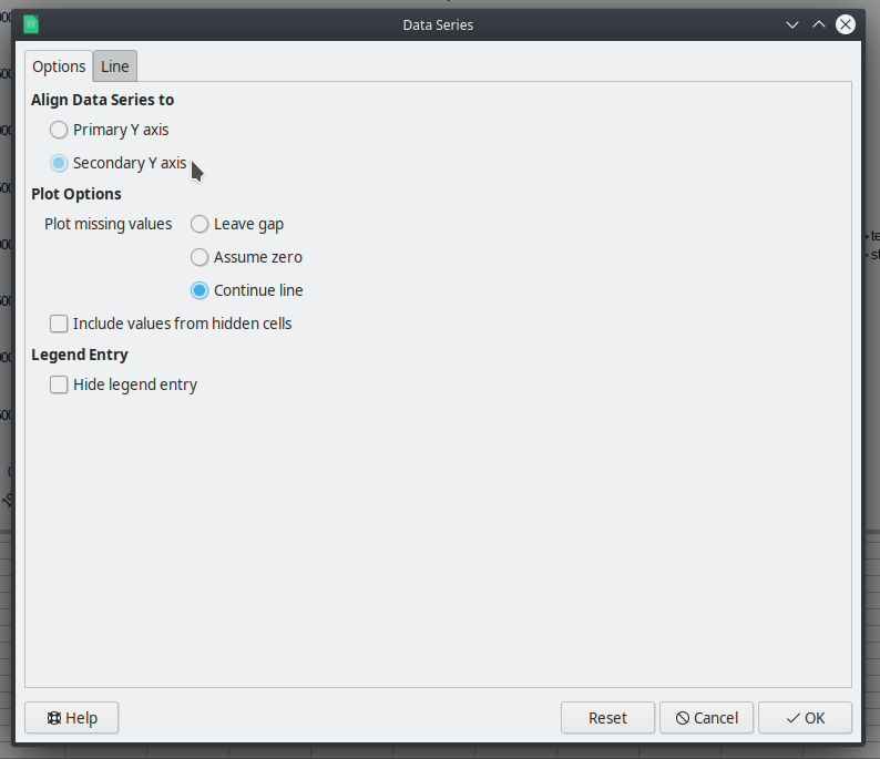
Hit OK. Then select the other line (in my case, the number of stakes), right-click it, and select “Format Data Series.” On the “Options” tab, I’m going to select to align this line with the “Secondary Y axis”:

Once you do that, you’ll see that LibreOffice automatically adjusts the scale of the other axis. Here’s how my chart now looks:

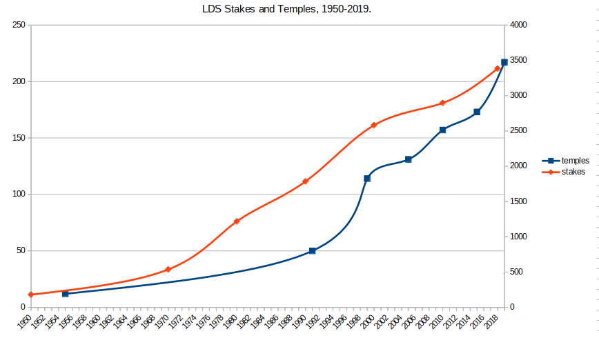
You can see that it changed the scale of the Primary Y-axis (the one on the left) to a maximum of 250 to reflect the smaller range of that data series. If you want to customize the scale used, you can always click on the axis you want to modify and then right-click it and select “Format Axis”:

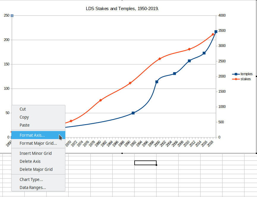
In the window that pops up, you can modify the scale of the axis by clicking on the “Scale” tab. If you want to change the values, click on the box next to “Automatic” to unselect it so you can put in your own values, then customize the value you add, like this:

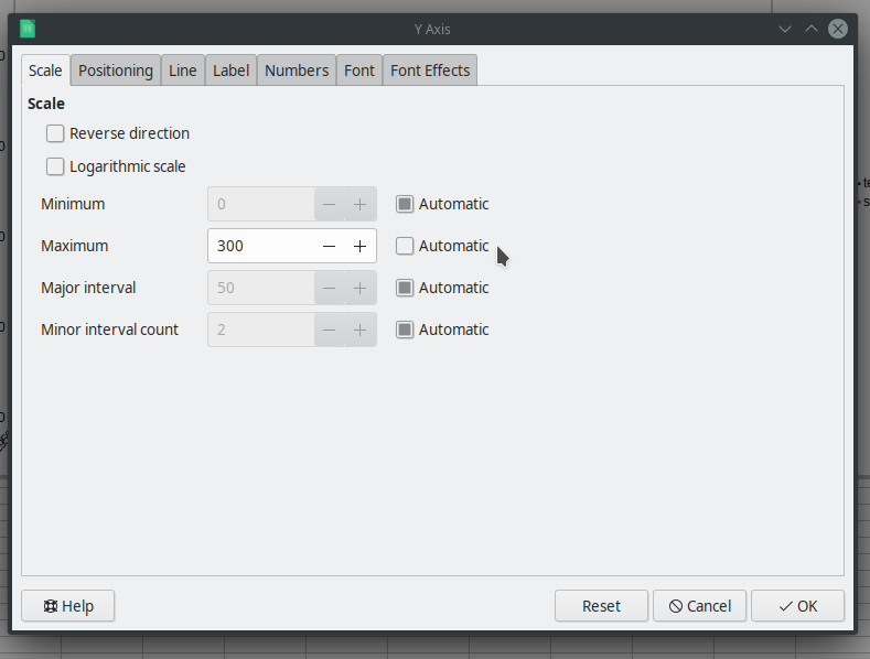
When you have modified the scale to your satisfaction, select “OK” and your graph will be updated with the scale you want, like this:

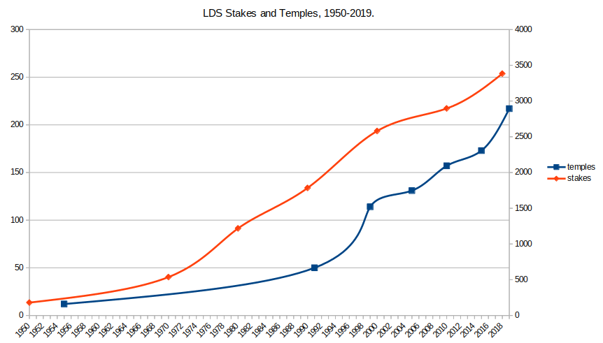
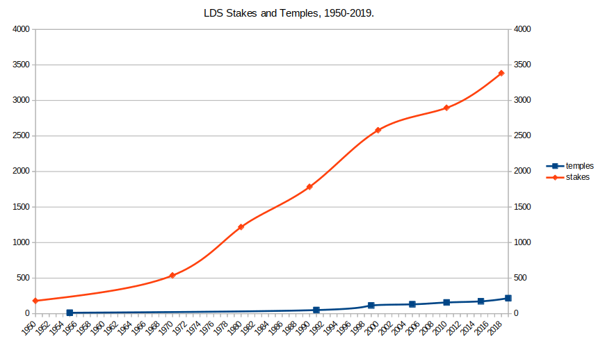
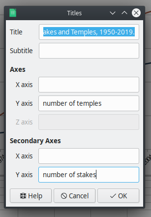
The resulting chart now has two axes with different scales. It would be a good idea at this point to label the axes to reflect the differences. Simply right-click on the chart and select “Insert Titles.” In that window, add appropriate titles. The left y-axis is simply the Axes while the right y-axis is considered the “Secondary Axes”:

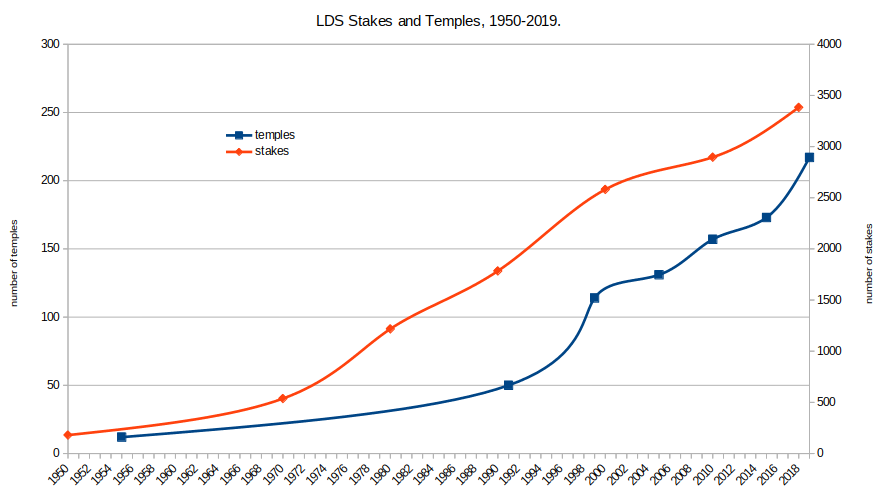
And your final graph will look something like this:

That’s how you can create a chart with two axes in LibreOffice Calc.
NOTE: This example was done in LibreOffice Calc version: 6.4.2.2 on a Linux-based operating system (Kubuntu 19.10).
![]()
