Here’s my situation. I have some data over time but I’m missing values in specific years. I want to graph that data but would rather not have to estimate all of the missing values. It turns out, LibreOffice Calc can do that for you in your chart. Here’s how…
Imagine I’m plotting the number of congregations in the LDS Church over time (weird example, I’m sure you’re thinking, but I’m a sociologist who studies religion, so, yeah, that’s what I do). I have the number of congregations in 1841, 1849, 1901, etc. Basically, I have the number in certain years, but I’m missing the number of congregations in lots of other years. I could interpolate the missing values (Excel has this function built in; LibreOffice Calc does not, but you can do it following the approach I have detailed here). But, I don’t really need to do that for my project. I just need a chart that shows the growth of congregations over time.
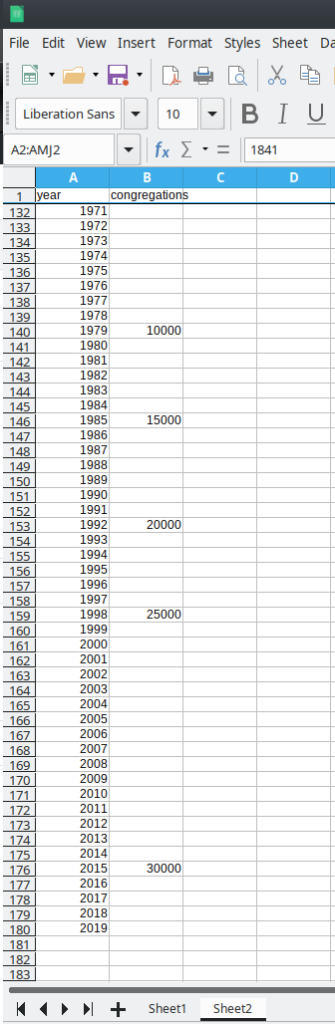
My data are organized into two columns. Column A is years and ranges from 1841 through 2019. Column B is the number of congregations with the values I have and lots of blank cells:

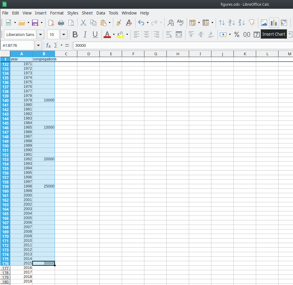
Select the cells you want to plot (A1:B176 in my case) then click on “Insert Chart”:

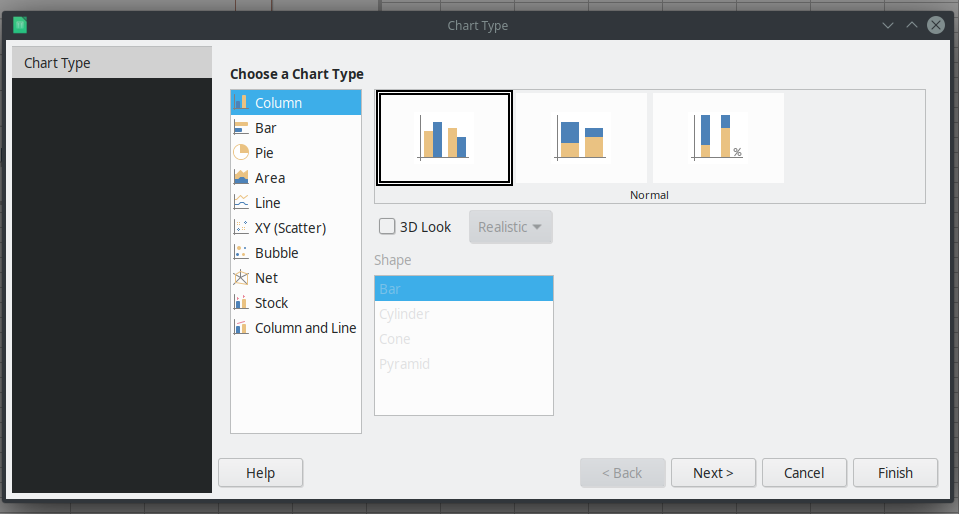
You’ll get this window:

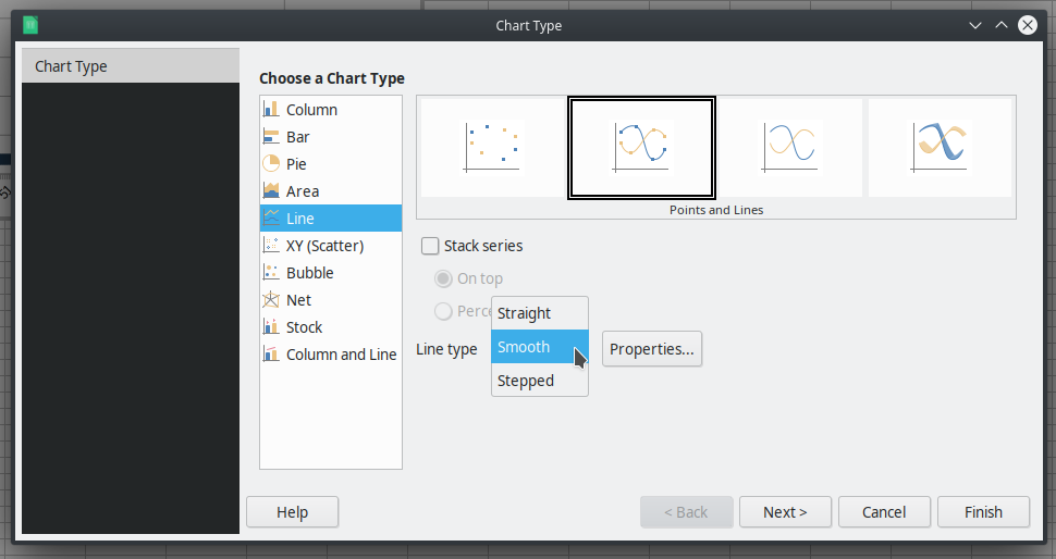
Since I want a Line chart, I’m going to select “Line” and because I want “points and lines,” I’m going to select that option as well. I also want “Smooth” lines rather than “Straight” lines, so I select that option, too:

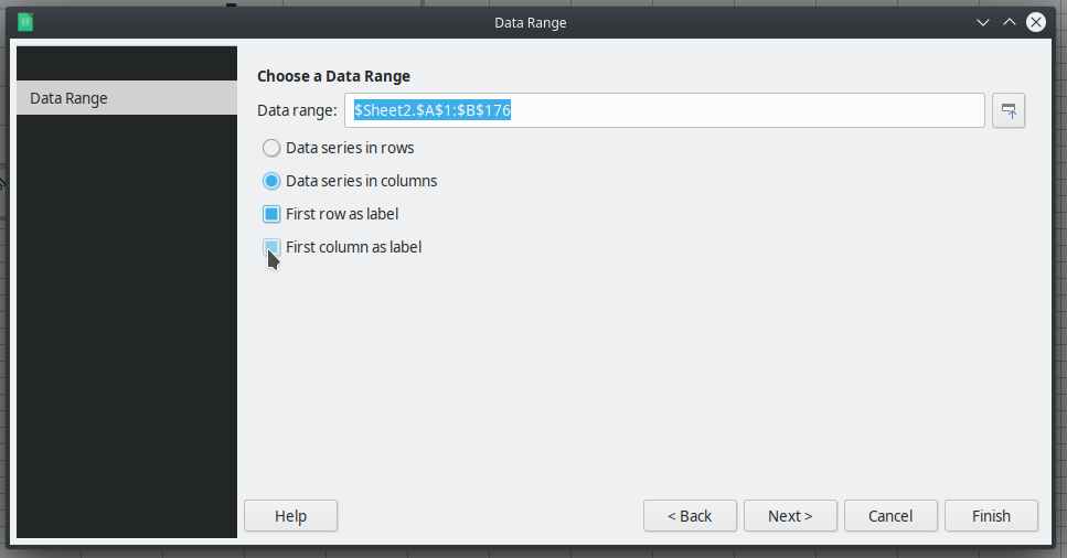
Click “Next >” at the bottom. Since you already selected your Data range, you shouldn’t have to change that. However, we do want the “First column as label” for the x-axis of the chart. So, select that option:

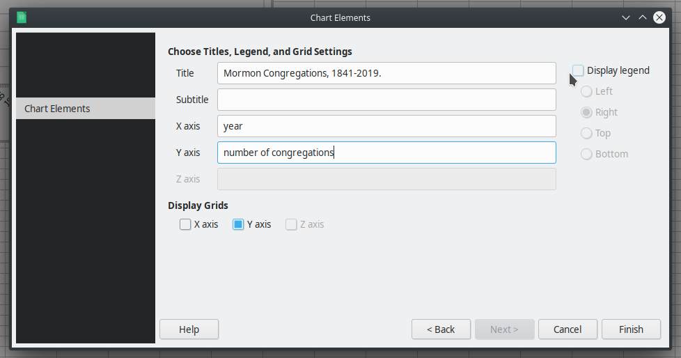
Then select “Next >”. You shouldn’t have to change anything on the Data Series tab, so you can hit “Next >” again. On the Chart Elements tab, you’ll want to describe your chart elements. Add a Title and label your x-axis and y-axis. I also didn’t need a legend since I’m only plotting one data series, so I turned that off:

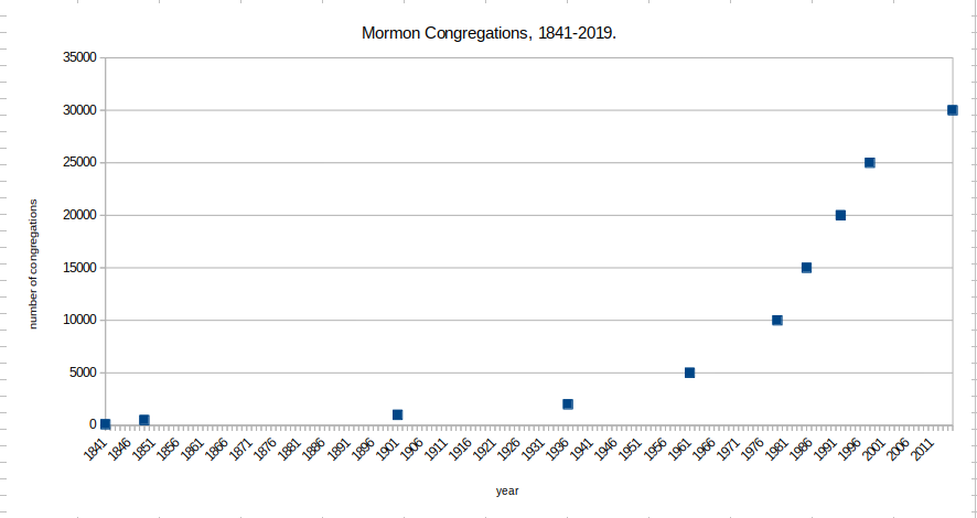
Then click “Finish.” You’ll have a chart, but it only has the points for the years when you have data, like this:

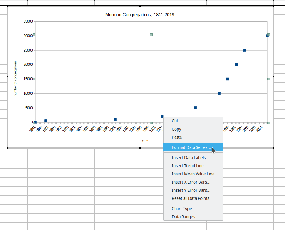
To add a line connecting the points and interpolating the missing data, click on the chart, then double-click it to modify the chart. Once you’re inside the chart, click on one of the points to select the data series, then right-click and select “Format data series”:

On the “Options” tab you’ll see “Plot Options” and just below that, “Plot missing values.” The default is “Leave gap.” Select “Continue line” and it will interpolate the missing values for you:

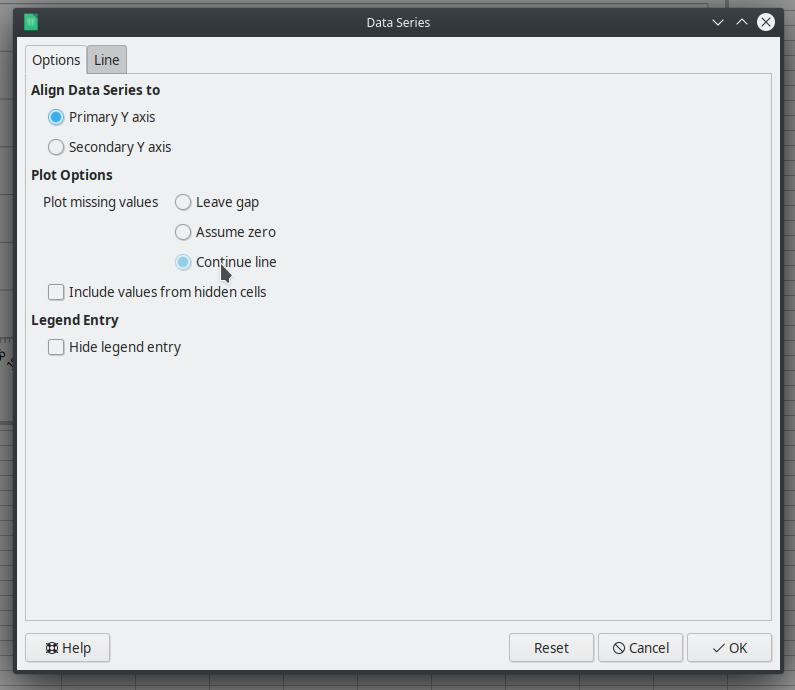
Select “Ok” and your line chart will now actually have a line, like this:

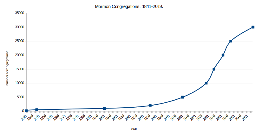
There you have it. A line chart with interpolated missing values in LibreOffice Calc without you having to calculate all of the missing values.
NOTE: This example was done in LibreOffice Calc version: 6.4.2.2 on a Linux-based operating system (Kubuntu 19.10).
![]()
