I was working on creating a chart in LibreOffice Calc that was kind of weird. Basically, I wanted to show change over time in a dichotomous variable (e.g., political party affiliation in the US – Democrat or Republican). I could, theoretically, make a chart where presence is indicated by “1” and absence is indicated by “0” or “2,” but I didn’t want the chart to suggest that one value was better than the other, which is what such a chart would indicate:
I realized, then, that what I needed was a way to tell the software which color to code each bar in the bar chart. Of course, that is possible by clicking on every single bar and customizing the color. But, with my data already indicating whether it should be one color or another and with over 100 cases to code, I was hoping to find a better approach.
I ended up finding a couple of websites (here, here, and here) that discussed a feature in LibreOffice Calc that was introduced in version 4.5 called “property mapping.” That seemed to hold the answer. However, as of LibreOffice 6.0.3 (the version I happened to be using), the “Property Mapping” option in the Data Range window of a chart was gone. Even so, the general process still works. So, here’s how to create the kind of chart I wanted.
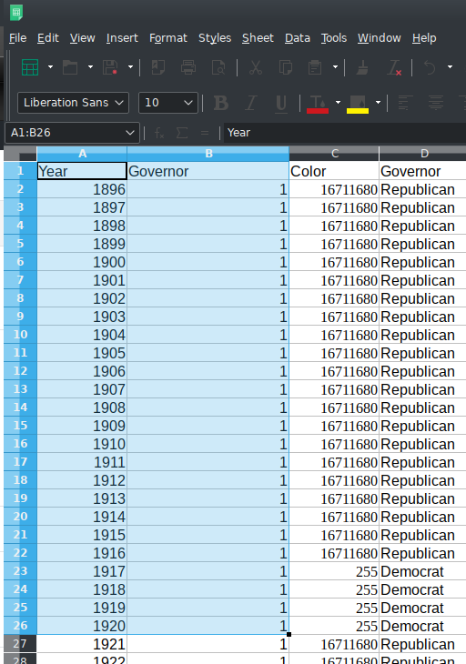
First, make sure you’ve got your data entered (obviously). Second, select the data you want to chart:
Select “Insert -> Chart” and then choose “Column” chart:
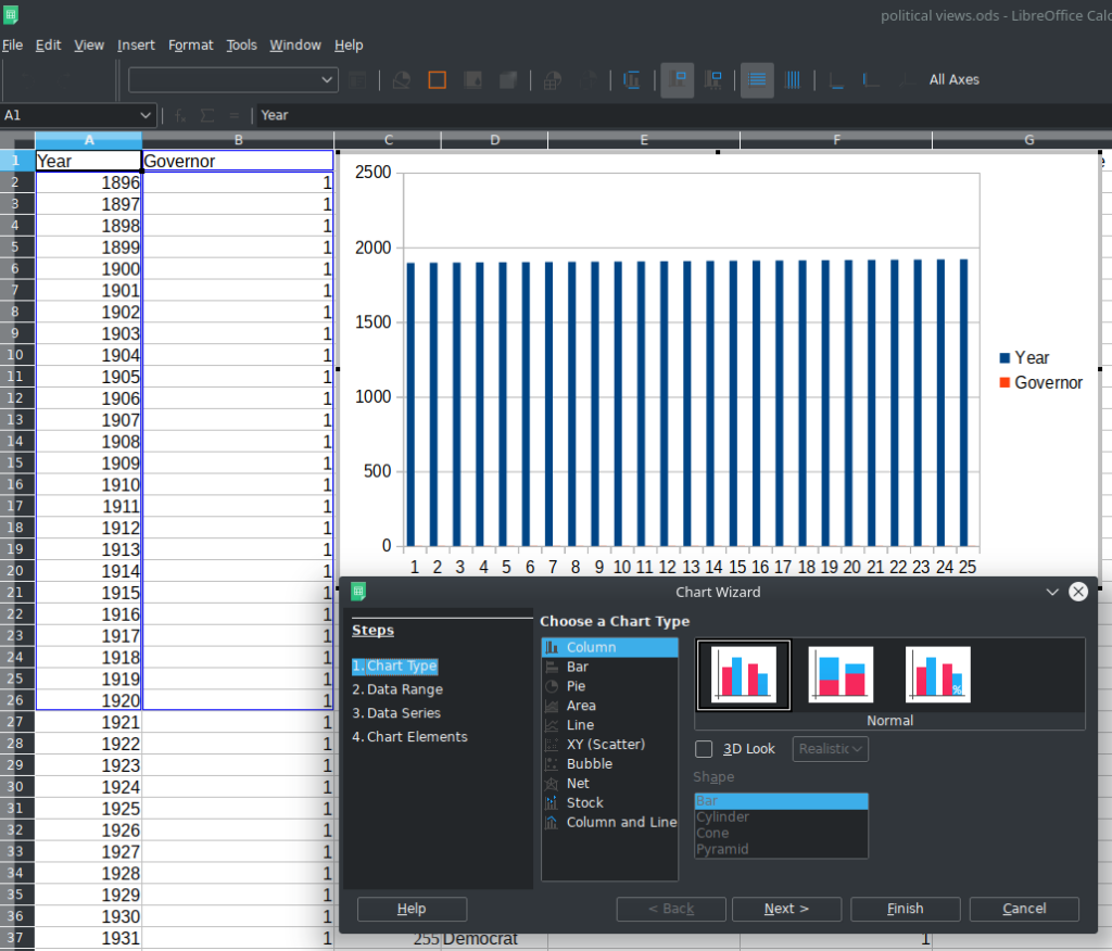
On the Next page of the Chart Wizard, make sure you’ve got your data selected correctly (I had to select “First column as label”):
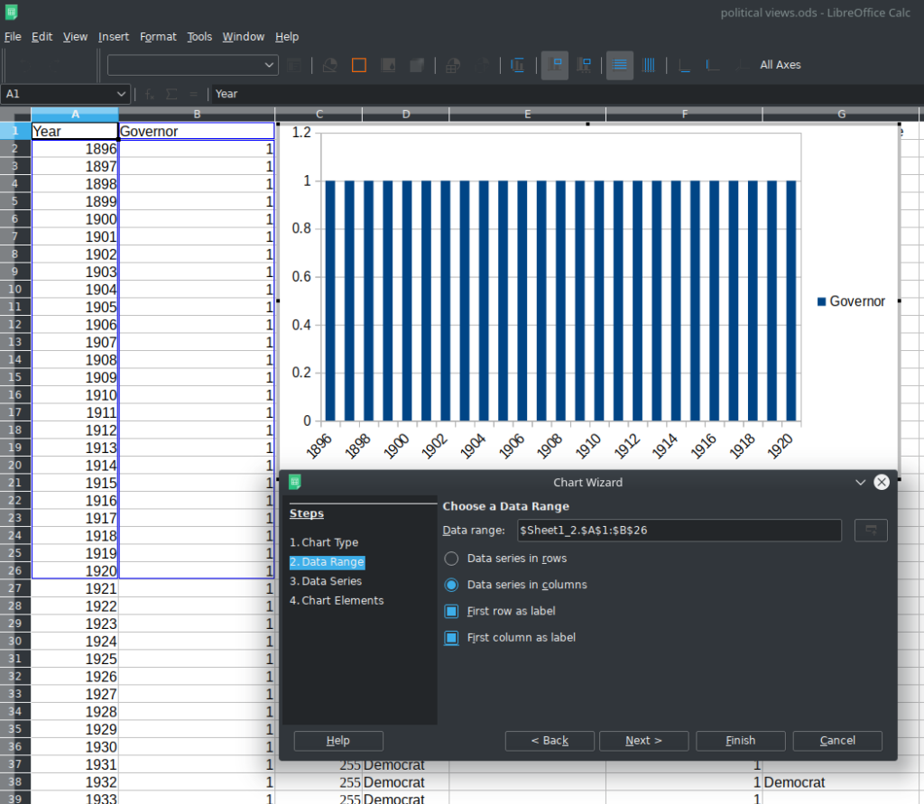
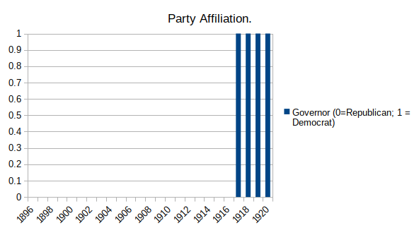
The problem with this, of course, is that I have coded everyone in the dataset with a “1” even though, in reality, some of the Governors in this dataset were Republicans and some were Democrats. Right now, it looks like everyone was a Democrat, but this is where the conditional formatting comes on.
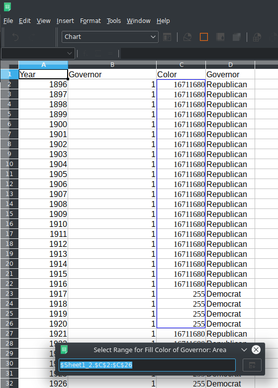
In your spreadsheet, you need to set up your conditional coding. This is done with “IF” statements. Here’s the code I used:
=IF(D2="Republican",COLOR(255,0,0),IF(D2="Democrat",COLOR(0,0,255),COLOR(255,255,0)))Basically, what this code does
Adding this to the chart is done in the “Data Series” step in the Chart Wizard. Alternatively, if you’ve already created your chart, select it, and right-click. Then click on “Data Ranges” and you can adjust this there. In the Data Series window, under “Data ranges:”, select “Fill Color”:
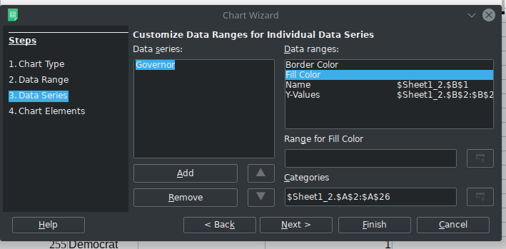
You’ll note that the “Range for Fill Color” box is empty. We’re going to fill that with the values we just generated using our conditional code. You can do this by clicking on the button next to that empty box, then select the corresponding values:
Once you have selected your fill color, your chart will now have the corresponding conditional fill colors:
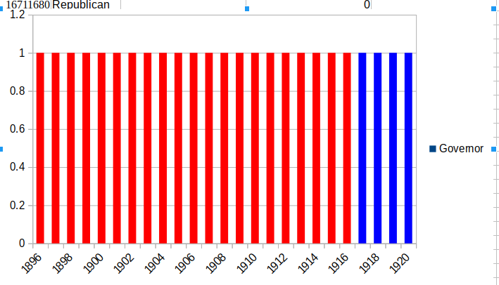
Of course, this chart still looks pretty crappy. The y-axis needs to be adjusted, the columns shouldn’t have any space between them, and it needs a title. Here’s my finished chart:
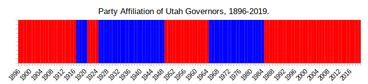
The chart provides a graphical representation of a dichotomous variable using color to illustrate shifts between political parties without suggesting that one party is better than the other. Et voila – conditional color formatting in LibreOffice charts.
![]()
Leave a Reply